An Extraordinary Life
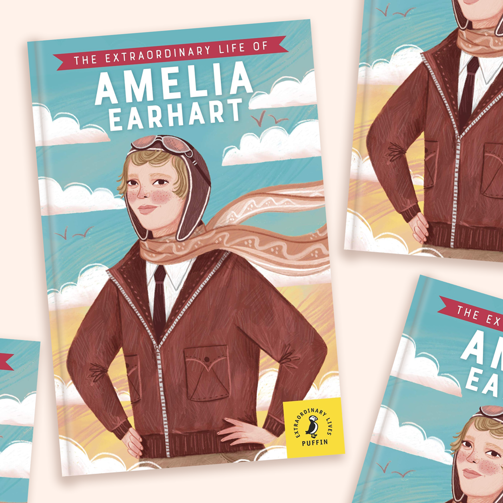
It was around this time last year that I began work on my first fully illustrated children’s book, ‘The Extraordinary Life of Amelia Earhart,’ by Dr Sheila Kanani and Puffin Books. I was absolutely delighted to receive this commission, it was like a dream come-true; and a goal that I always wanted to reach in my illustration career. I have been fascinated by Amelia’s inspirational life and mysterious demise since I was a child. It was truly an honour to illustrate her story, and introduce her name to a whole new audience.
I loved illustrating the front cover. I wanted Amelia to look determined, heroic, and proud. I was inspired by vintage aviation posters and magazines. The interior illustrations are all grayscale, so it was great to work in full colour for the cover and explore a colour palette that set the tone of the book.
From initial sketch to final cover. I always start a sketch in a rusty red colour - I’m not sure why but it just makes me feel a little bit more confident with putting down lines. Maybe black lines feel too ‘final.’ I then move on to a more finished sketch and change the colour to blue, then black for the client. Once approved, it’s on to the colouring stage. I usually (and prefer to) work with a more unsaturated and muted tonal palette for my illustrations - I’m just not a ‘loud’ colour person when it comes to illustration. As you can see from the above GIF, the final cover does change to a more saturated palette. The client wanted the aesthetic to fit with previous covers in the series, so I had to saturate the colours. It’s all part of the process, and it’s of course important to meet the clients needs.
You can see more of the interior spreads over in my portfolio. But here’s one spread that I loved working on. The GIF shows the first sketch, followed by the final illustration. I was provided with a basic layout of the whole book, with gaps left for the illustrations. I used these layouts as my base layer, and sketched in my ideas so that they harmonised well with the surrounding text placement.
I drew so many planes. I had never drawn a plane before, and I know why. They are difficult to draw! I’m just a bit ‘blind’ when it comes to planes and motor vehicles - the shapes are all very new to me as an illustrator because I tend to draw flowers, humans/animals, and buildings. But I loved the challenge of it. The range of things I had to draw in this book just showed me how much more I have to expand my subject matter, and not to be afraid to try drawing these objects and shapes.
Whenever I open a picture book, I always look forward to gazing over the end pages. I love a patterned end page - discovering hints of what the story is about. Of course my end pages had lots more planes involved, but it was fun though. Putting together a pattern is always an exciting process.
Something to consider when illustrating a book with a main ‘character’ (and one who ages), is to maintain a good likeness so the reader can follow the character throughout the pages. Luckily for me, Amelia had very distinctive facial features and an amazing hairstyle. When drawing the young Amelia I kept certain details consistent, such as a big bow in her hair, freckled cheeks, and her short hairstyle. These characteristics were applied then to older Amelia - freckles, short hair, and a bow - now used in her fashionable outfits instead of her hair.
Last Christmas I treated myself to this Amelia Earhart Christmas decoration! It was a little gift to myself to always remember this proud achievement in my career. The book is available in all good bookstores, and I hope you pick up a copy, and are inspired by Amelia’s incredible story.
~ Rachel x


